
Welcome to a new bookish journey around the world! In this post we talk about the book covers of The Book of Mirrors by E.O.Chirovici, an international bestseller published in 38 countries (Twitter/EugenOChirovici). As I greatly enjoyed reading this book, I was really curious how its covers were illustrated around the world and I made a selection of the most interesting ones. See below what I discovered!
Note: if you haven’t read the book, I recommend you to first get acquainted with the basic storyline, to better understand the cover illustrations and the remarks I wrote for each of them.
Let’s start with two English speaking countries. The American and British covers depict the broken mirror concept, being inspired by the name of the book. As the narrator explains, the title refers to “the maze of distorting mirrors you used to find at carnivals [..] everything you saw when you went inside was both true and false at the same time“.
However, the second British cover does not follow the pattern, but it does relate to a certain aspect of the book. No more spoilers!

Next, we have some Latin languages with interesting covers. The Romanian edition bets on a big fragmented title with a vintage image of Princeton University (the story’s location) in the background. The French edition goes with the classic broken mirror theme, while the Italian edition seems to use the manuscript component of the story.

The German and Dutch editions are extremely similar, focusing on the iconic tower of Princeton University. The second Dutch cover and the Polish cover have a different approach, showing a young man that, from my point of view, seems to be unhappy. That’s also an interesting approach, though I would argue these two covers would not spark too much interest in someone who does not know anything about the story.

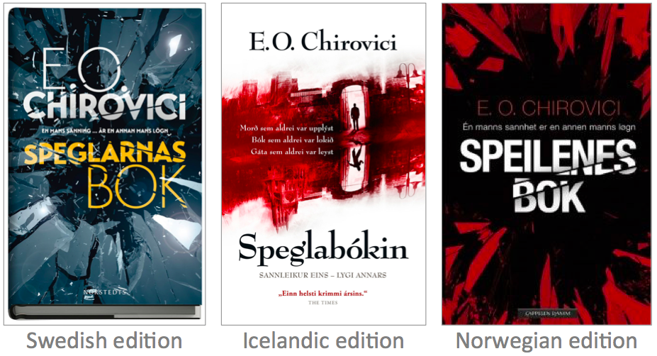
When going to the Northern Europe area we find more dramatic approaches toward the broken mirror concept (the Swedish and Norwegian editions), and also a bloody yet suggestive cover of the Icelandic edition.
The Book of Mirrors was also published in the Asian part of the world! Here we find distinctive approaches than the ones above. The Chinese edition combines the mirror and manuscript concepts, while the Indonesian cover combines a silhouette with the broken mirror idea. From my point of view, the weirdest cover is the Taiwanese one … a dark and abstract image that does not hint at the story’s elements. Not so abstract, but still different then the other covers, the Turkish edition reminds me of a video game experience.

To sum up, the symbols used for the covers of The Book of Mirrors are quite homogenous and they reflect the main elements of the story. However, the book benefits from a diverse range of creative approaches, which is something that fascinates me and inspired me to start this blogging series.
I hope you enjoyed this bookish journey as much as I did! Tell me, what’s your favourite book cover of the ones mentioned above?
If you would like to buy books or other (non)bookish things, please consider using one of these links: Amazon | Waterstones | Carturesti. Thank you!
‘Till next time … happy reading!
Georgiana
Images’ sources: USA edition | USA edition | UK edition | UK edition | Romanian edition | French edition | Italian edition | German edition | Dutch edition | Dutch edition | Polish edition | Swedish edition | Icelandic edition | Norwegian edition | Chinese edition | Taiwanese edition | Indonesian edition | Turkish edition | World map
