
Welcome to a new bookish journey around the world! In this post we are talking about the book covers of “The Handmaid’s Tale” by Margaret Atwood. As I greatly enjoyed reading this book and it has received a lot of media attention lately, I was really curious how its covers were illustrated around the world. It was difficult to choose the most interesting ones, you’ll see there are so many intriguing covers!
Note: if you haven’t read the book, I recommend you to first get acquainted with the basic storyline, to better understand the cover illustrations and the remarks I wrote for each of them.
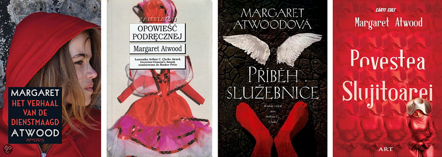
First I want to show you what I consider to be the most known English covers. I think they’re all attractive, and it is clear that red is the predominant colour when it comes to the English book covers (this colour has a special meaning in the book).

There are also some less known English covers, which is quite understandable considering they’re not so appealing from a visual perspective. Especially the covers situated on the second row below are way too quite scary from my point of view …

For Germany I found 3 covers, all with “special” elements: the first one looks quite childish and totally unrelated to the story, the second one has the classic red touch but I don’t understand where the white collar comes from, and the third cover is simpler, with a green and red flower – might be a symbol of fertility?

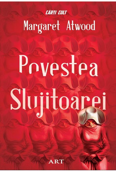
Let’s continue with other European covers. The Dutch cover reminds me of the Red Riding Hood, while the Polish edition depicts doll clothes, maybe pointing to the role of the handmaid in Gilead. The broken winds illustrated on the Czech cover suggests the inner turmoil of the handmaids. The Romanian edition has also a catchy look 🙂
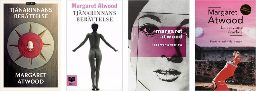
Now let me show you some very weird covers from Sweden and France. Yes, the first cover is very appealing and it is inspired by the TV series … but what do you think about the other three ones? Let’s take it one by one. The Swedish cover with the naked woman is really out of context … even if I might understand where the idea came from, it does not suggest at all the quintessence of the story.
Then the first French cover shows an attractive woman, wearing make-up. From what I remember, handmaids were supposed to be as “invisible” as possible, so it is not really representative of the story. And for the last French cover, I don’t even know what to say … at least it has a tint of red in the composition.
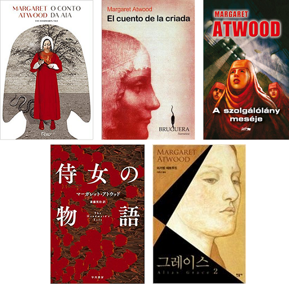
Let’s see some old-school covers. The Portuguese, Spanish, and Hungarian covers (first row) depict vintage-style images of handmaids, all using shades of red. I find the Japanese cover very interesting, as it is one of the few covers without women on it (the other two I found are German). I also find intriguing the Korean cover – even if it does not use the classic red colour, I like the geometric approach and the choice of colours.
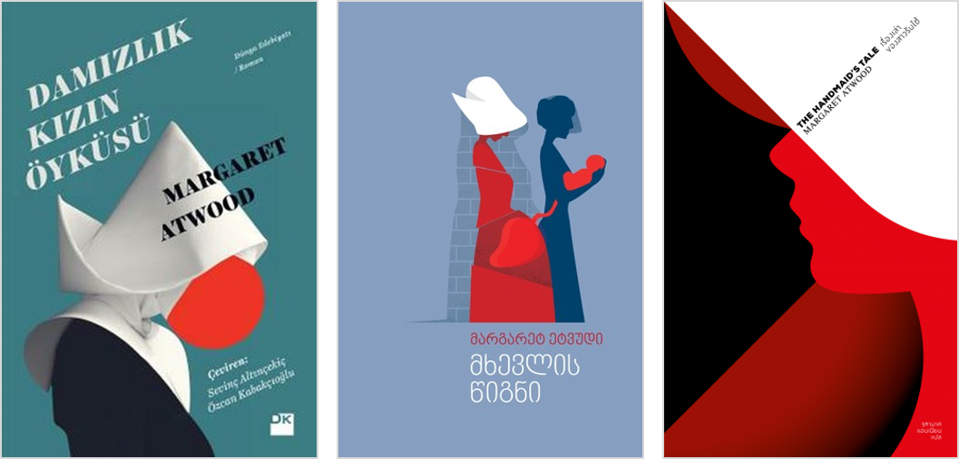
I saved the best for the last! The most modern approach is for sure taken by the covers from Turkey, Georgia, and Thailand. I love the simple and geometric concepts, I would pick up any of these three covers while wandering in a library!
I hope you enjoyed this journey around the world at least as much as I did! “The Handmaid’s Tale” by Margaret Atwood is one of the best books I read in 2017, and I think the large diversity of covers proves the big success of the book. What’s your favourite cover?
If you would like to buy books or other (non)bookish things, please consider using one of these links: Amazon | Waterstones | Carturesti. Thank you!
‘Till next time … happy reading!
Georgiana
Images: Goodreads | Germany 1 | Germany 2 | Germany 3 | Turkey | The Netherlands | Poland | Romania | Czech Republic | Sweden 1 | Sweden 2 | France 1 | France 2 | Japan | Korea

I love Margaret Atwood. My favourite book is Grace.
LikeLiked by 1 person
I’ve started watching the recent TV series adaptation recently, the story seems very promising! 🙂
LikeLike
It is a really nice idea to follow the covers of some special books or authors. Congratulations for the idea!
LikeLiked by 1 person