
It is no surprise that I am fascinated by book covers and their diversity around the world. If we take a step backward and look at the process of designing THE cover of a book, there’s a lot of work that is not visible to the readers.
In this post share my thoughts about different versions of book covers that existed before the official book cover was created. During the iterative process there are many versions of the cover that do no make it. Some concepts are fully rejected, while others need multiple rounds of improvements in order to make all stakeholders happy.
Note: I did not read any of the books illustrated in this post. My comments are based only on the design of the cover and do not concern the content of the book.
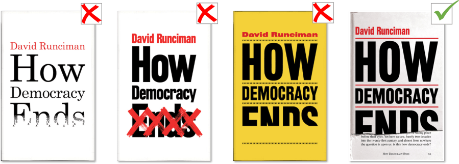
How Democracy Ends by David Runciman
A book about politics with a bold touch. What better way to depict an end other than literally “not ending” the book cover? I like a lot the different approaches towards the unfinished touch – fading, crossing, cutting – and I completely agree that the final cover is the best one!
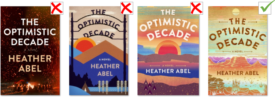
The Optimistic Decade by Heather Abel
For “The Optimistic Decade” it seems that the initial direction with the bonfire was quickly abandoned and there were more iterations on the vintage poster idea.
To me it looks like the point of view is getting further and further, reaching the helicopter view for the approved cover. The combination of colours of the final cover is lovely!
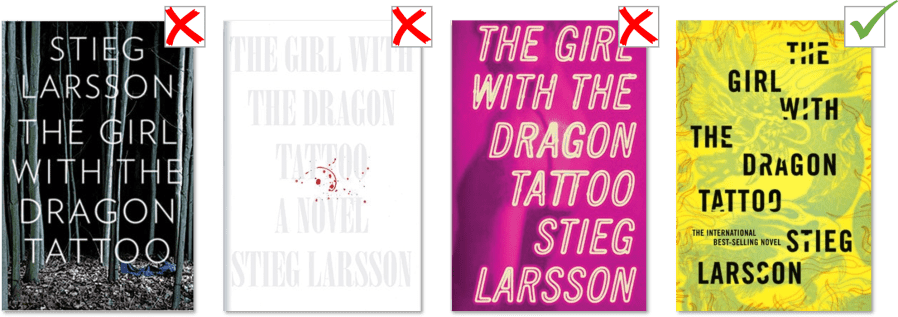
The Girl with the Dragon Tattoo by Stieg Larsson
For a psychological thriller, I consider the book covers to be quite playful, especially the pink and yellow ones. According to the designer, he came up with “dozens of concepts”, so it’s no wonder they are so different.
Oddly, the final cover design is also the most obvious one – it has a dragon image on the background. One of those moments when the easy way is the best way 🙂
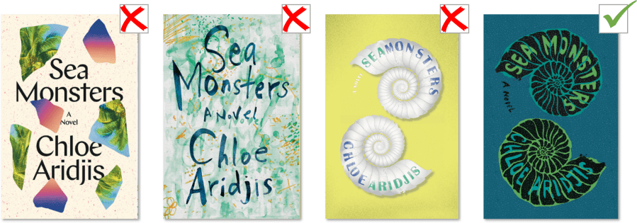
Sea Monsters by Chloe Aridjis
In the case of “Sea Monsters”, I find much more appealing the second design on the left (green-ish watercolour) compared to the final design. The first and the third lack depth and do not reflect the “sea monster-ish” aspect of the title. From this point of view, the green covers seem more appropriate.
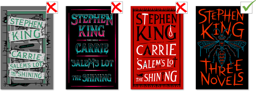
Three Novels (Carrie, Salem’s Lot, The Shining) by Stephen King
Despite his popularity, I managed not to read any book by Stephen King so far. And these book designs only confirm my documented assumption that it might not be my cup of tea 🙂
I find it interesting that the three rejected covers included the names of the three novels, while the approved cover summarizes “Three Novels”. In this context it is more appealing keep it simple and write as little text as possible on the cover. The more visual the cover is, the less effort it takes to process it.
Thank you for joining me on another journey in the world of book cover design!
‘Till next time … happy reading!
Georgiana
Sources of the pictures: EyeOnDesign.aiga.org | Wired.com | ElectricLiterature.com link 1 | ElectricLiterature.com link 2. Cover photo by Toa Heftiba on Unsplash.

Interesant!
LikeLiked by 1 person
I like the second Sea Monsters book cover best, too.
LikeLiked by 1 person
I enjoyed your post on book covers and to see the different versions that were considered for some popular books. The book cover is pretty important as it might be the thing that first draws you to the book!
I really enjoy your blog and I nominated you for a blogging award – the Liebster Award! Here is the link to my post with the nomination (see the bottom for the update) – https://tierneycreates.com/2020/05/07/liebster-award-nomination-part-i/
If you like you can play along and notify your readers of your nomination, answer the 7 questions I posed to you, share 7 facts about yourself and nominate 7 other bloggers (or do any of these activities that interest you). No obligation!
LikeLiked by 1 person
Thank you for the nomination! I’ll join! 😀
LikeLiked by 1 person